Auckland Philharmonia Orchestra
Branding and Illustration
Branding and Illustration
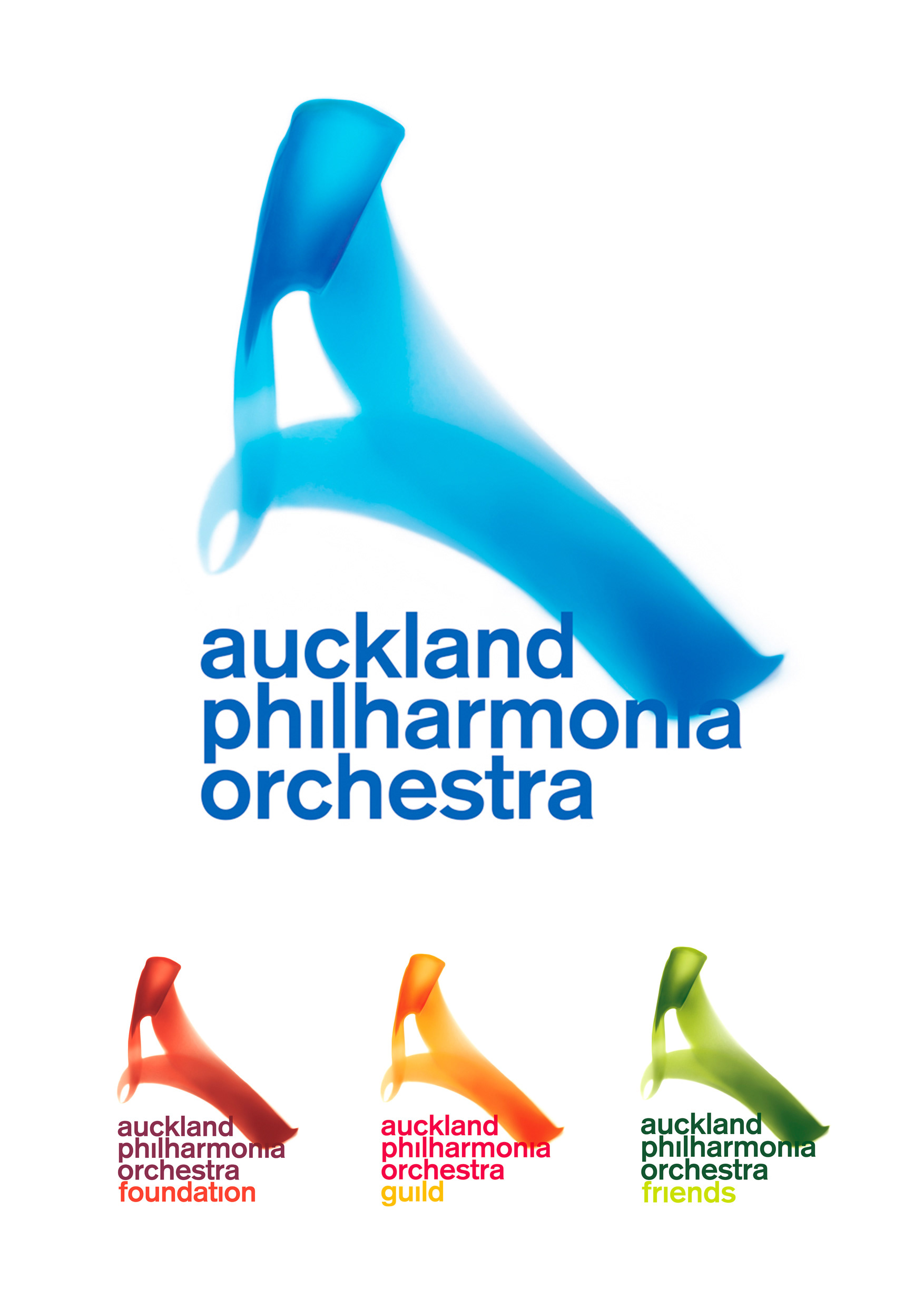
I created the logo utilising a combination of light movement photos composed in the dark and then manipulated and illustrated. The logo had to be able to be used on a white background as well as a black background, and also be able to be reproduced in spot colours, cmyk and RGB formats. The coloured variations also had to be able to work to the various format requirements. The logo represents the 3/3 beat of a conductors baton, and also forms the ‘A’ shape required for the Auckland Philharmonia Orchestra.

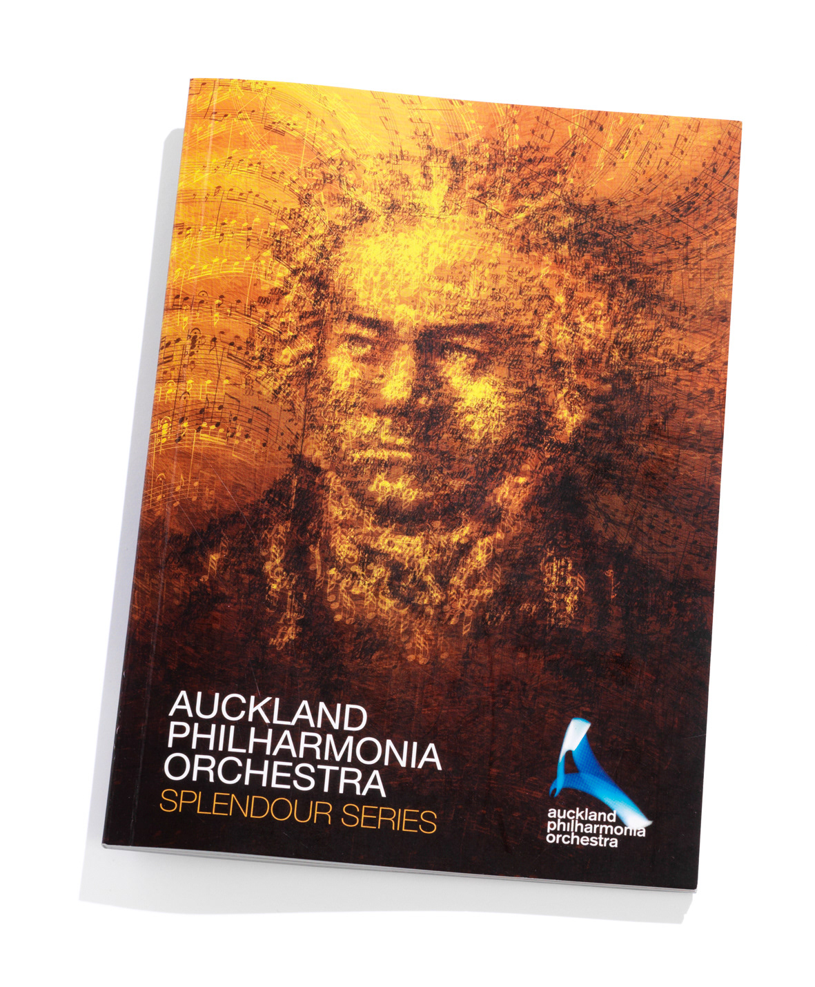
Beethoven was illustrated using layers of his music built up to create an oil painting style effect.


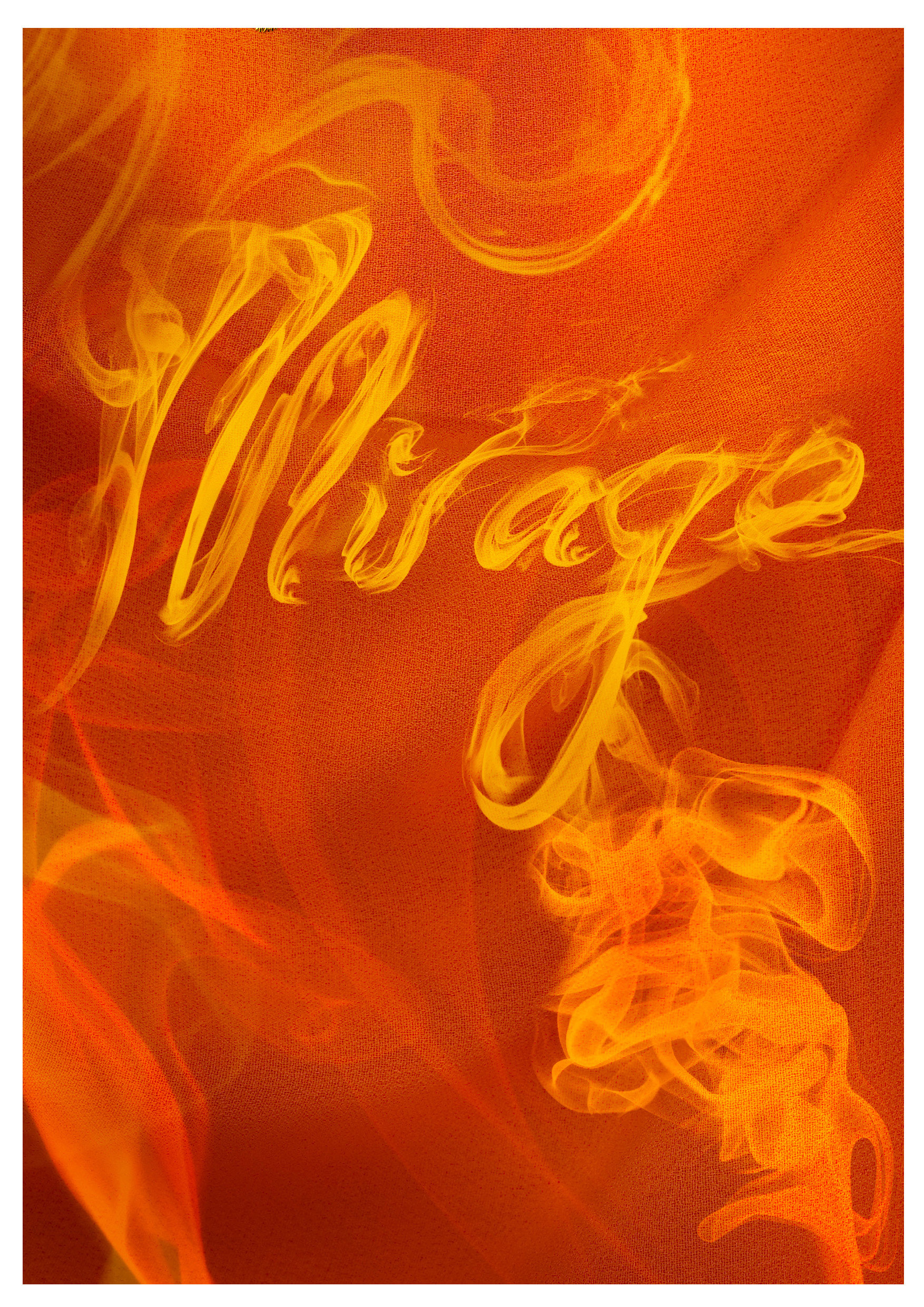
I illustrated the gold embroidery effect in photoshop along with image manipulation to the face, fabric, and illustrating the smoker writing.
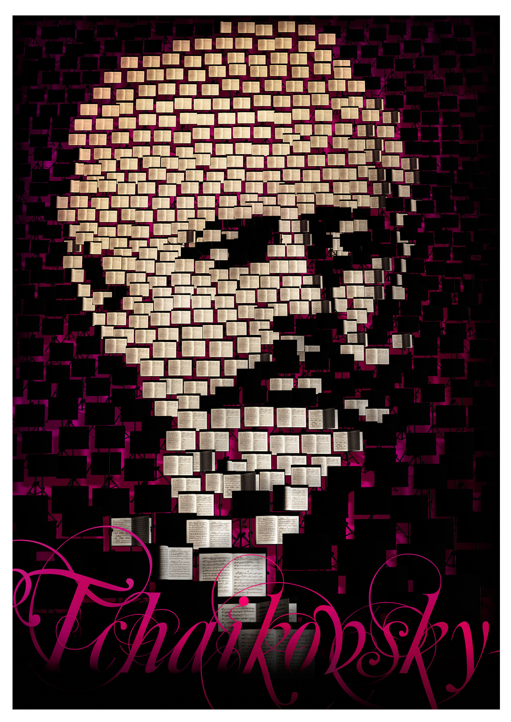
I created this illustration using music stands with the music pages turned to create additional shadow.


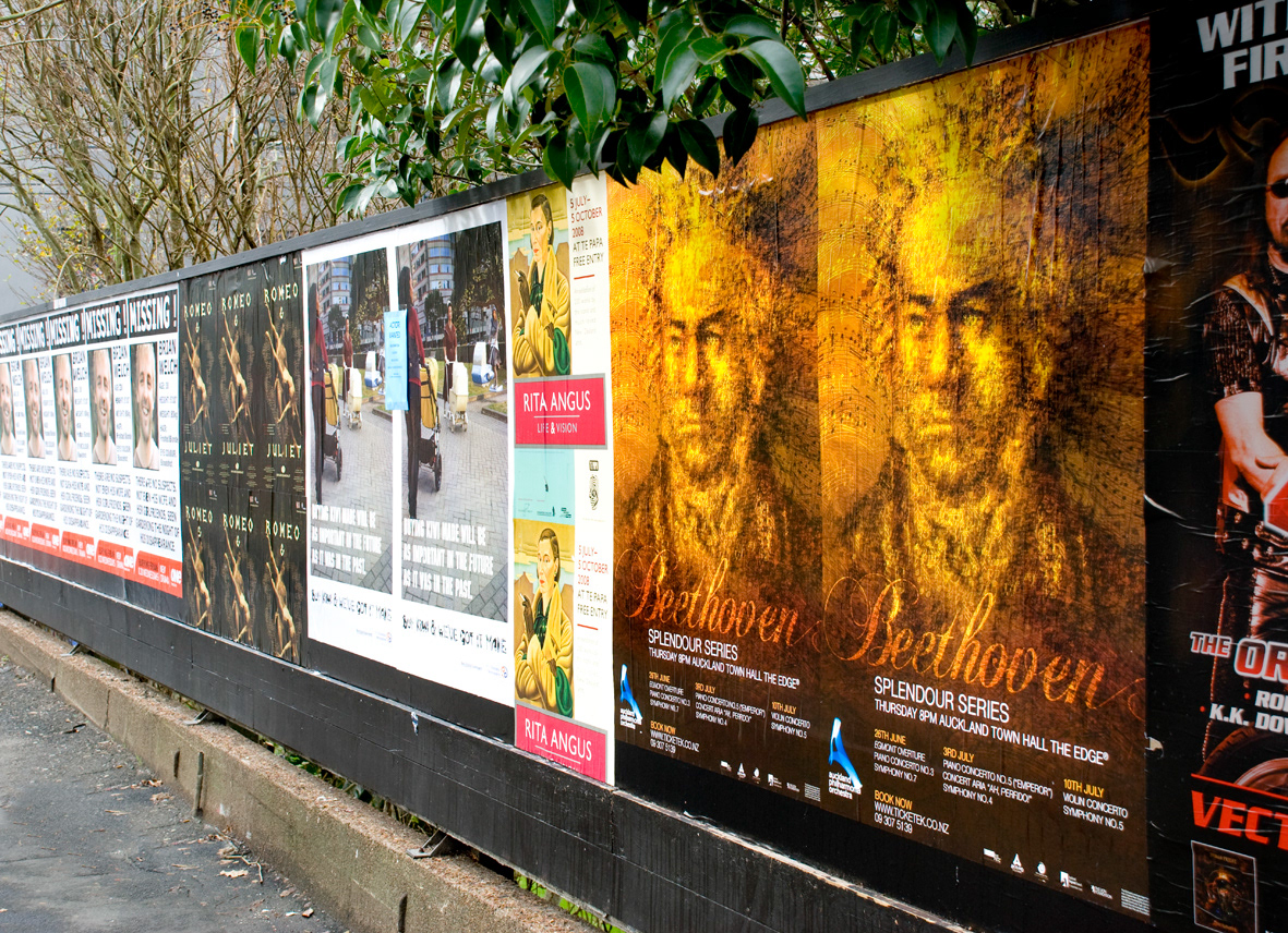
Posters join up seamlessly.

