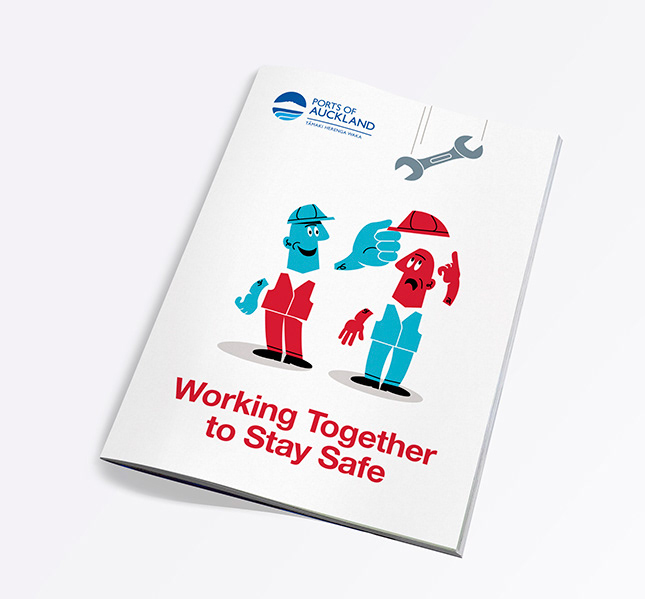
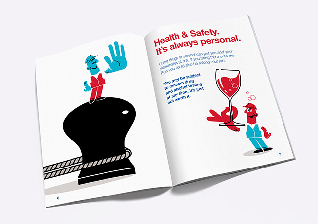
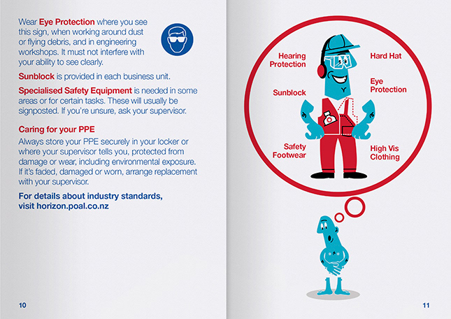
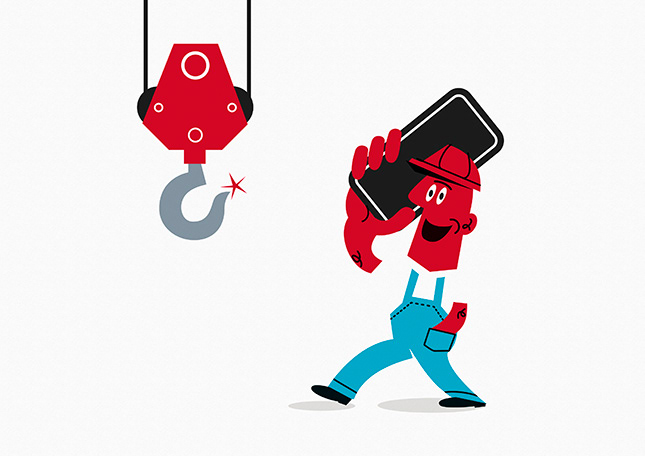
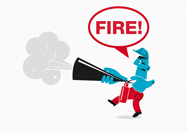
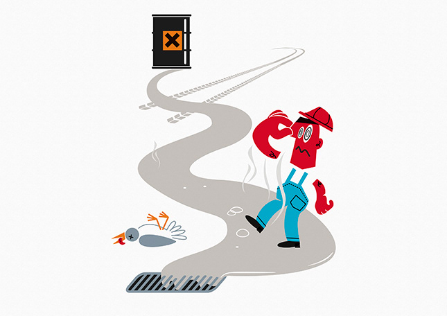
Safety is a number one priority at Ports of Auckland. The nature of their 24/7 operations means the port can be a high risk area. The quirky illustrations were designed for Angle's client, Ports of Auckland, to communicate safety essentials in an way that is easy for staff and visitors particularly those with English as their second language to understand. The blue character does the right thing and the red character does the wrong thing.
To see more visit http://www.angle.co.nz