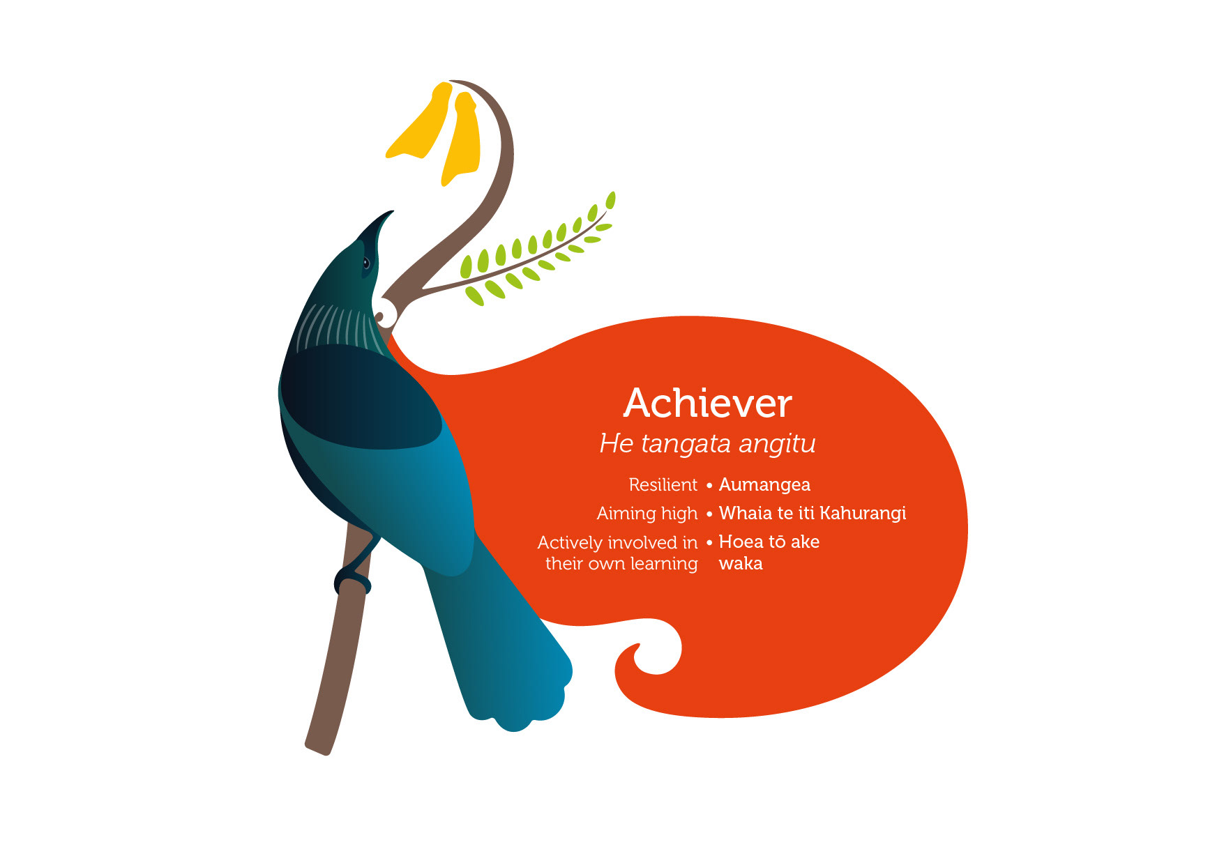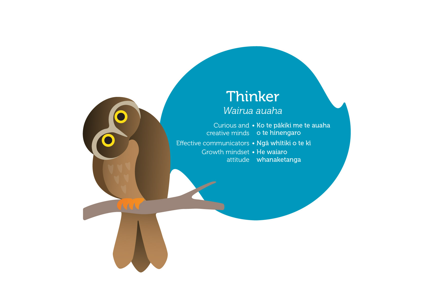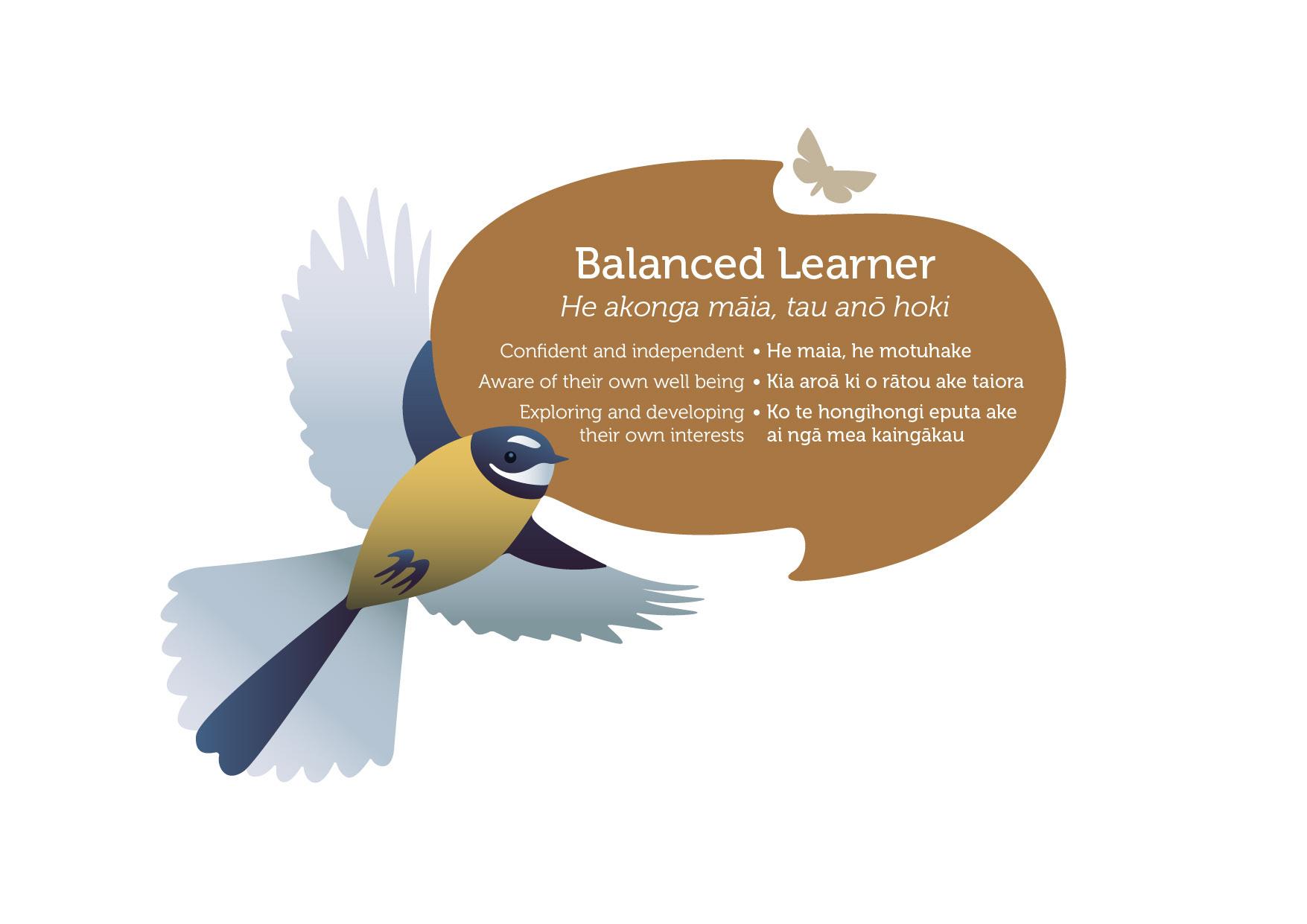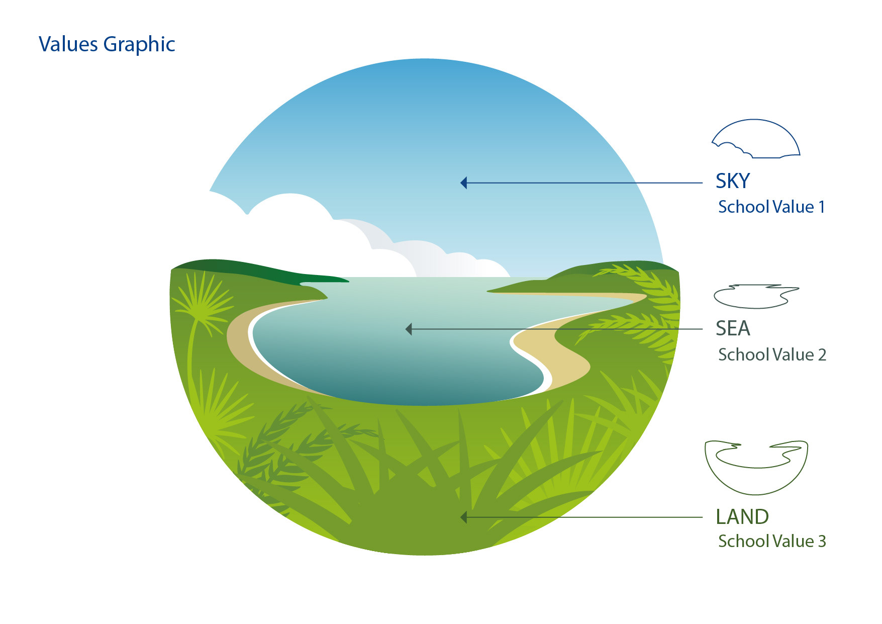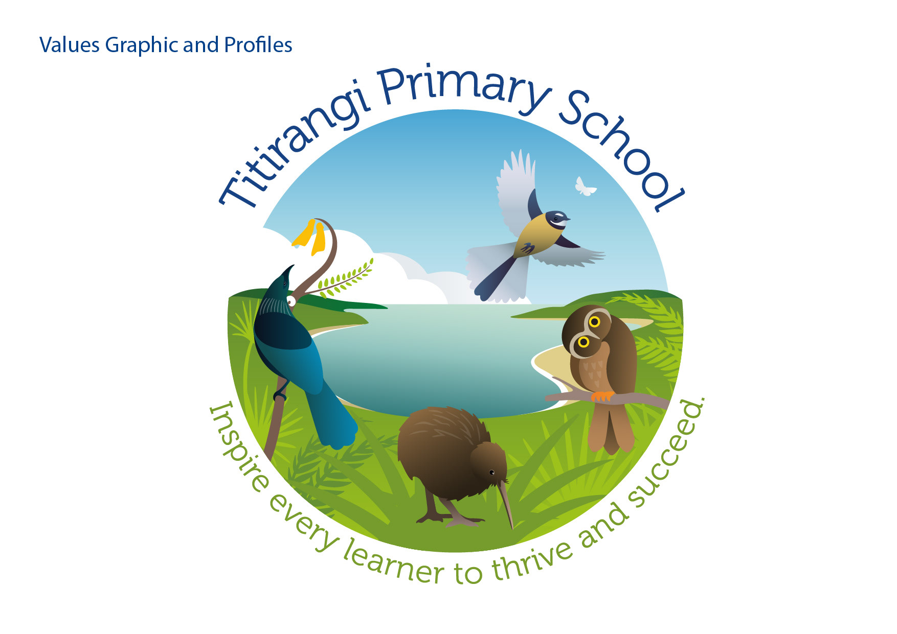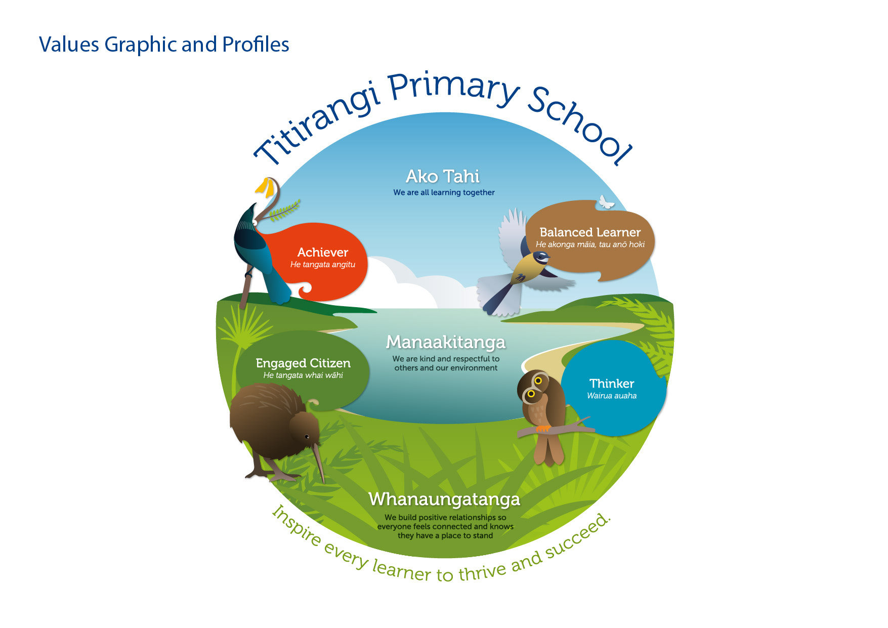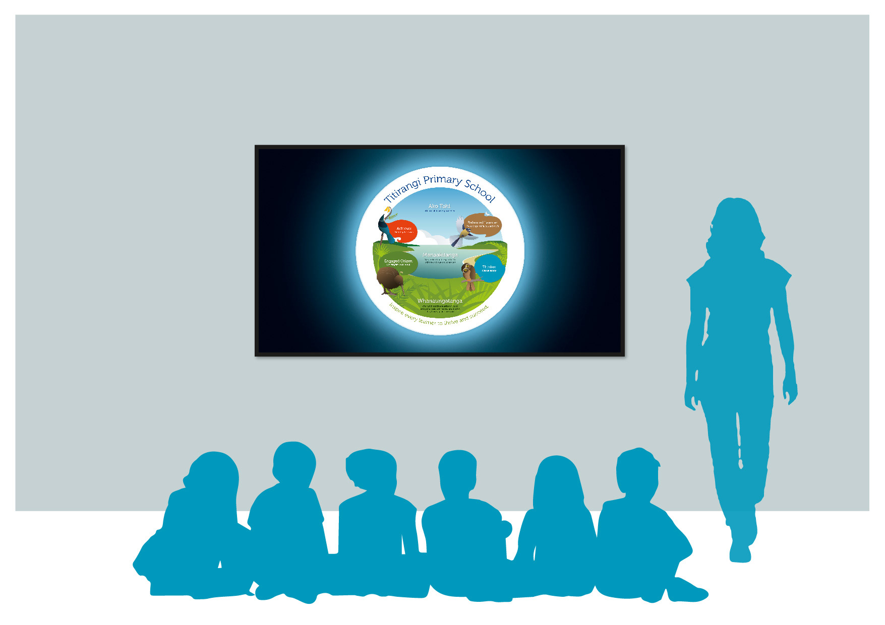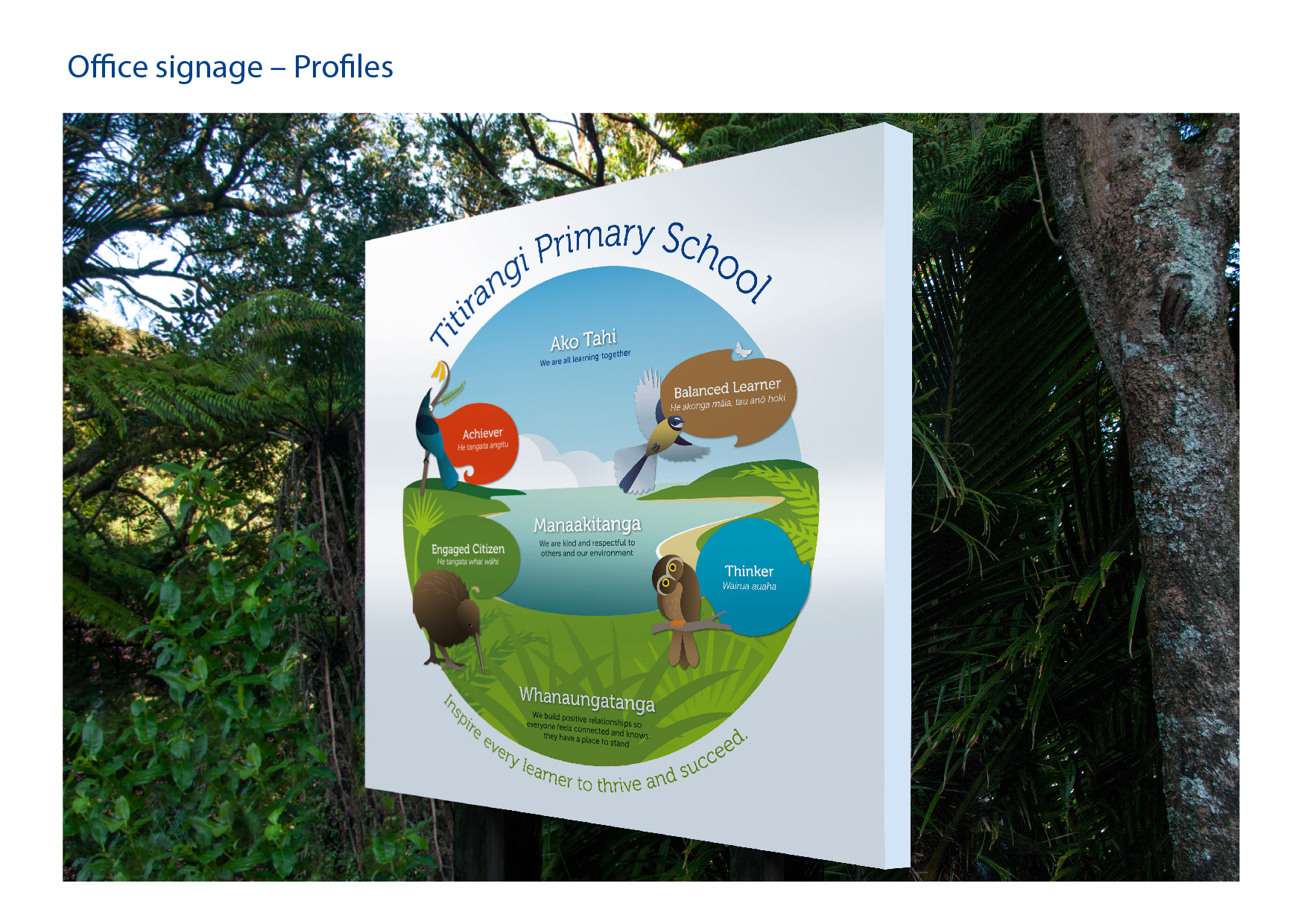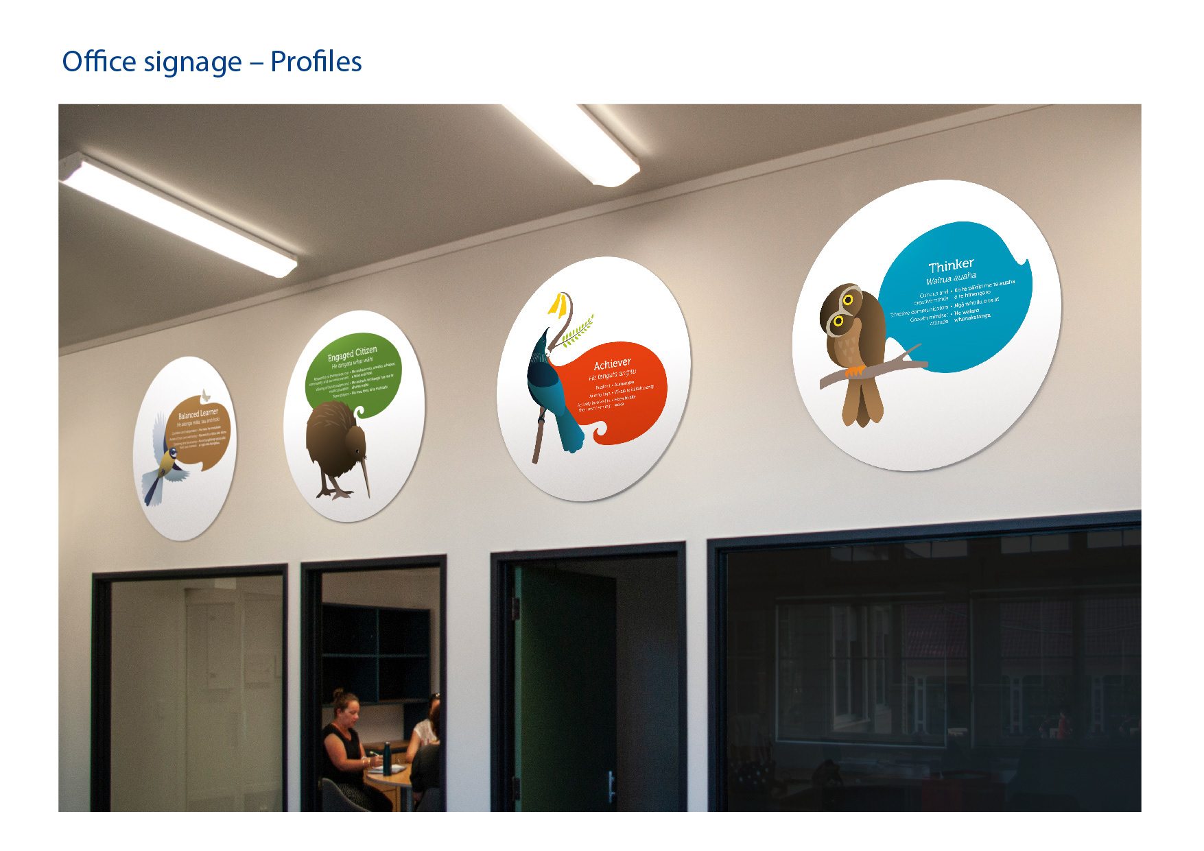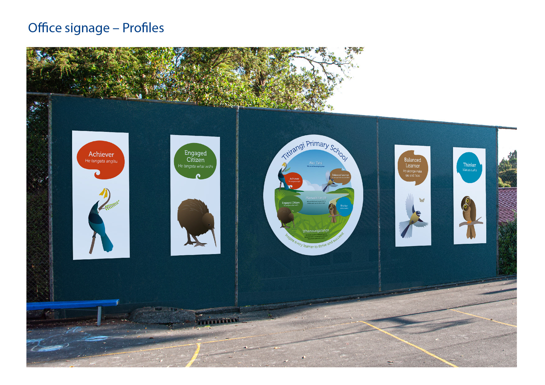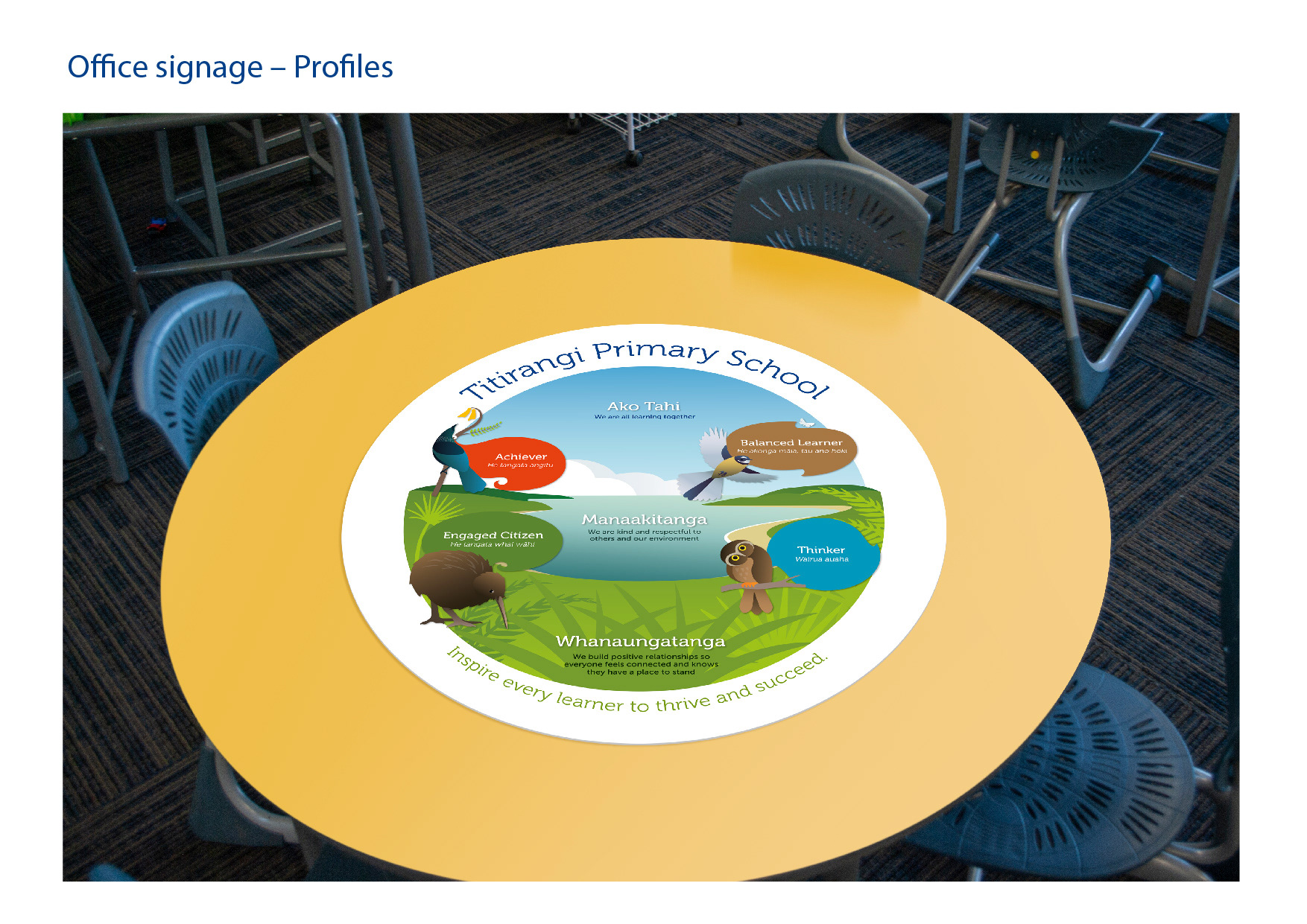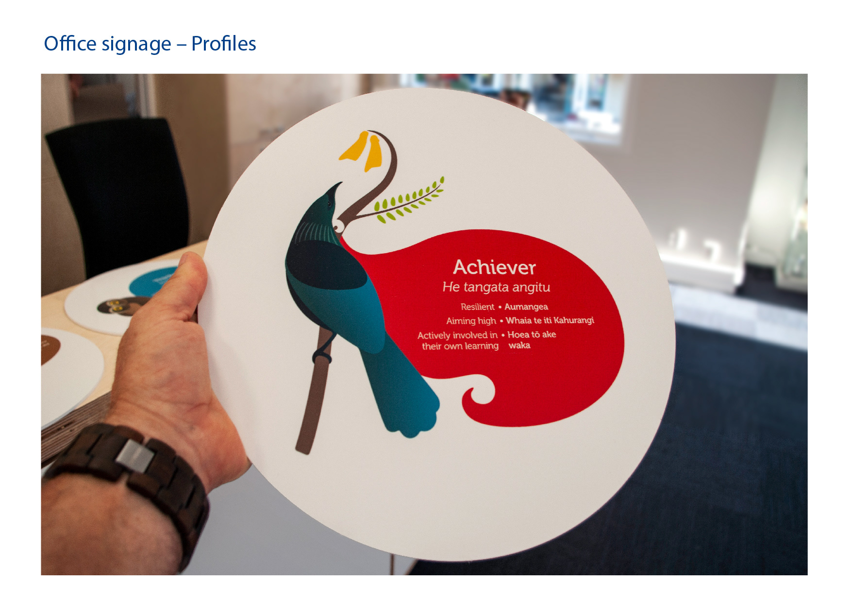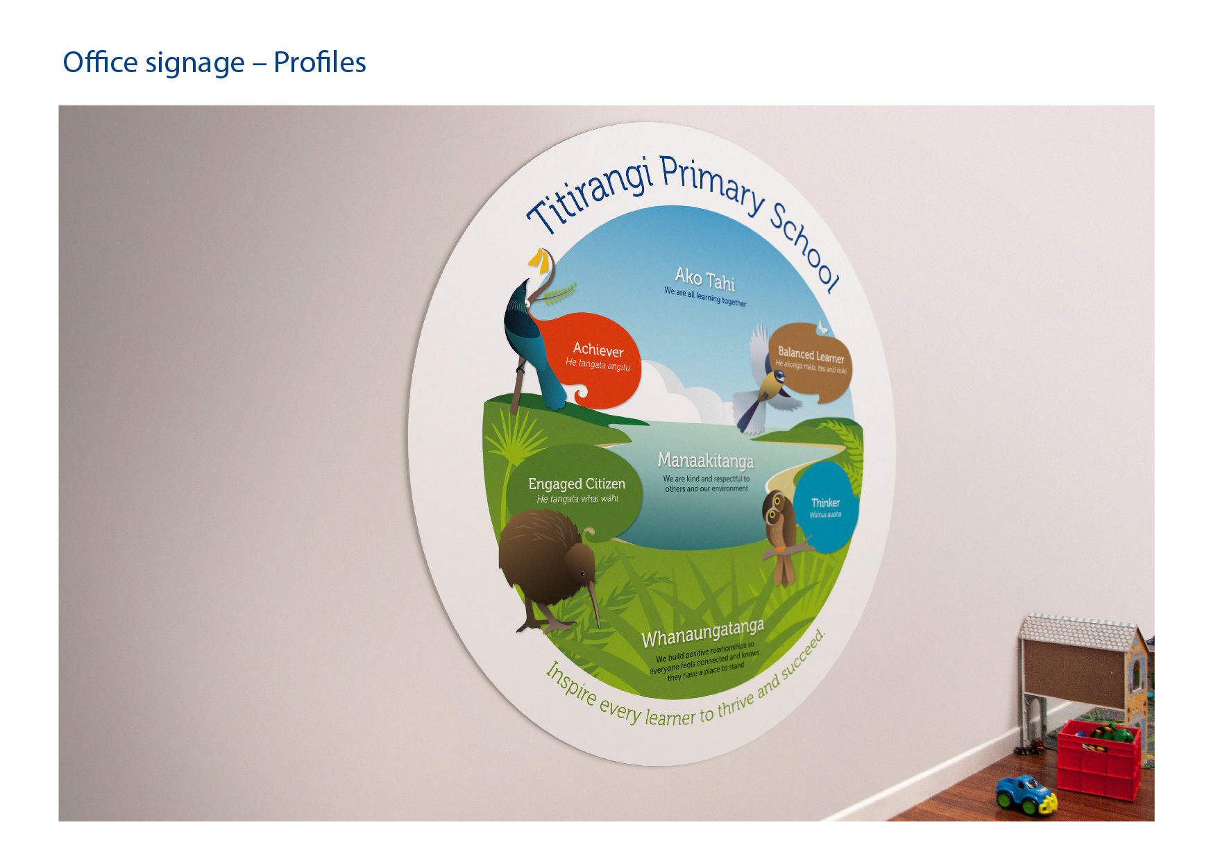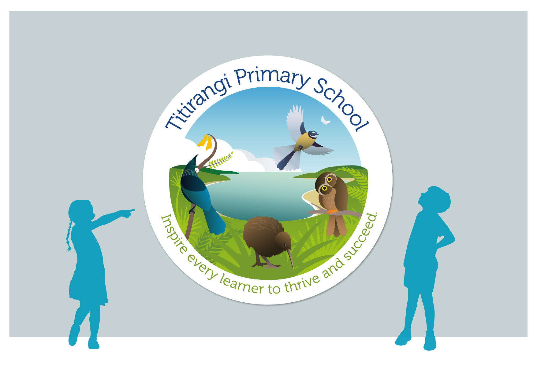
Problem: Titirangi Primary School set in a landscape of Native trees and bush in New Zealand had existing Core values and Learner profile collateral material along with reward systems in the form of certificates. The material wasn't fully in sync with the current Titirangi Primary School brand and the profile graphics were not necessarily appealing or cohesive and did not integrate well with the core values landscape graphic. The problem I was given was to work out a way of integrating the 'Core Values' and 'Learner Profiles' in a graphic format that could be more cohesive to the original brand story, logo and colours for Titirangi Primary School. This integrated graphic format needed to be designed for different applications incorporating English and Maori translations, with the ability to separate the profiles and values for teaching purposes and for signage applications etc.
Solution: My solution was to create a NZ species (bird) for each profile based on the profile definitions for each, keeping in mind the similar attributes of the particular bird chosen for each of these profiles. I then turned the values graphic into a more global world-like structure based on the NZ environment, using three separate areas to defining each of the three core values… these became sky, sea and land. The profiles and values could then be fused together in a more cohesive structure that enabled easier learning migration within the classrooms, with the ability to create interactive tools to help students become more familiar with these ideals. One more solution was to make the English - Maori translations easier to learn, by stacking the two languages side by side and using a single middle point system to highlight each definition. This allows the end user to be able to read each English translation, and then refer to the Maori translation with ease.
#schooldesign #touchstone #primaryschool #TitirangiPrimary #Titirangi